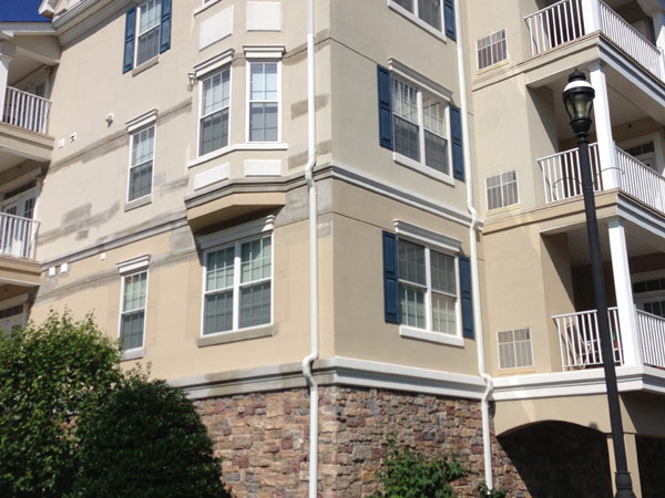
When someone drives past your commercial building, the color is the first thing they notice — before your sign, before your logo, before anything else. The right exterior paint color does quiet but powerful work: it builds trust, signals professionalism, and makes your property memorable. The wrong one does the opposite. This guide covers everything you need to know about choosing the best exterior paint colors for commercial buildings, apartment complexes, and office buildings.
Why Exterior Paint Color Matters More Than You Think
Color psychology is real, and in commercial real estate it directly affects how people perceive your business before they ever step inside. A well-chosen exterior paint color communicates stability, energy, or approachability depending on the palette — and it ties your building’s appearance to your brand identity.
Beyond perception, the right color choice also affects long-term maintenance costs. Some colors fade faster under UV exposure. Others show dirt and grime almost immediately. Choosing wisely from the start saves money over the life of the building.
What to Consider Before Picking a Color
Your building’s architecture. A modern glass-and-concrete structure suits cool grays, blacks, and whites. A heritage or masonry building with detailed trim work calls for warmer, more traditional palettes. The color should enhance what’s already there, not fight against it.
Fixed elements you can’t paint. Roof material, exposed brick, stonework, and window frames are permanent anchors in your color scheme. Any paint color you choose needs to complement these first.
The surrounding environment. Buildings surrounded by heavy landscaping benefit from earthy, nature-harmonizing tones. Urban buildings in dense commercial corridors can be bolder. You want to stand out — but for the right reasons, not because you clash with everything around you.
Climate and sun exposure. Lighter colors reflect sunlight and keep exterior surfaces cooler. Darker tones absorb heat, which can raise interior cooling costs in warmer climates. In areas with intense UV exposure, inorganic pigments — earth tones, grays, beiges — hold their color significantly longer than organic ones like bright reds or yellows.
Best Exterior Paint Colors for Commercial Buildings
1: Charcoal Gray and Crisp White
This combination remains one of the most popular exterior paint color choices for modern commercial buildings — and for good reason. Charcoal gray reads as sophisticated and professional, while crisp white trim keeps it from feeling heavy. It works beautifully on glass, concrete, and metal panel construction. Law firms, tech offices, and financial institutions regularly gravitate toward this palette for its clean, authoritative feel.
2: Navy Blue with Natural Accents
Navy blue commands respect. It’s a dominant color that projects stability and reliability — which is why it’s commonly used by corporate offices and professional service businesses. Pairing it with natural wood accents or warm stone elements softens the intensity and creates a welcoming contrast that balances polish with approachability.
3: Warm Neutrals: Tan, Beige, and Greige
Warm neutral tones are the workhorses of commercial exterior paint. They appeal to the widest range of tenants and customers, age gracefully, and hide environmental dirt better than stark whites. Tan and beige tones are especially effective for medical offices, childcare centers, banks, and any business where a welcoming, non-intimidating exterior matters. A “greige” — the blend of gray and beige — has become a go-to for multi-tenant buildings and apartment complexes because it reads as both modern and timeless.
4: Sage Green and White
Sage green has grown steadily as a commercial exterior paint color, particularly for wellness businesses, boutique retail, and eco-conscious brands. It’s muted enough to feel sophisticated rather than playful, and when paired with crisp white trim it creates a fresh, harmonious facade with strong curb appeal. It also performs well against natural landscaping, making it a popular choice for suburban office parks and apartment buildings surrounded by greenery.
5: Terracotta and Warm Cream
For warmer architectural styles — Mediterranean, Spanish Colonial, or stucco-clad masonry buildings — terracotta paired with warm cream is a natural fit. The baked-clay hue handles intense light beautifully and gives commercial buildings a rich, grounded warmth that reads as established and premium. It’s particularly effective for hospitality venues, restaurants, and mixed-use retail developments.
6: All-White or Off-White
A clean white or off-white exterior never goes out of style. It signals cleanliness, efficiency, and openness — making it a top choice for healthcare facilities, restaurants, and professional offices. The caveat is maintenance: white shows dirt faster than any other color, so it works best in lower-traffic environments or where regular exterior cleaning is part of the building’s upkeep routine.
7: Deep Mocha and Cream
For coffee shops, boutique hotels, bakeries, and artisanal retail, a rich mocha or warm brown exterior paired with cream trim creates a cozy, established feel that draws people in. It’s one of the best exterior paint color combinations for ground-floor commercial spaces that rely heavily on walk-in foot traffic.
Exterior Paint Color Combinations for Apartment Buildings
Apartment buildings have slightly different requirements — the palette needs to work across a large surface area, appeal to a broad demographic, and hold up over years of exposure without looking dated.
The most effective exterior paint color combinations for apartment buildings tend to use a neutral primary color — warm gray, greige, or soft beige — with one or two accent colors on balcony railings, entry features, or window trim. This creates visual structure without overwhelming the eye across a large facade.
Dark accents on entryways and window frames — charcoal, deep bronze, or black — are one of the most impactful details you can add. They define the building’s architecture, mask minor surface imperfections, and give the overall exterior a polished, intentional look even when the primary color is subdued.
Colors That Hold Up Best Over Time
Durability should be part of the color conversation, not an afterthought. Earth tones, mid-range grays, and greige tones are the most forgiving — they hide gradual fading, don’t show dirt rapidly, and maintain their appearance longest between paint cycles. Bright organic pigments like vivid reds, yellows, and purples fade fastest under UV exposure and may require repainting significantly sooner.
For the paint itself, 100% acrylic latex exterior paint is the standard for commercial applications. It’s flexible enough to handle thermal expansion and contraction, resistant to mildew and dirt, and formulated to last. On textured surfaces like stucco or concrete block, choosing a color with a slightly higher light reflectance value helps the building look brighter and more uniform across the rougher texture.
How to Test Colors Before Committing
Never choose a commercial exterior paint color from a small swatch alone. Paint a large test section — at least a few square feet — directly on the building wall. Observe it at different times of day and in different lighting conditions: early morning, midday, overcast, and at dusk. Colors shift dramatically between natural light and shadow, and what looks perfect on a sample card can read completely differently at scale on an exterior wall.
Before You Paint: Does Your Building Need Restoration First?
Choosing the right color is only part of the equation. If your building’s stucco, EIFS, or masonry has cracks, water damage, or failing sealants, applying paint or an elastomeric coating over compromised surfaces won’t hold — and can actually trap moisture and accelerate damage.
Adriatic Restoration handles the full scope: facade repair, stucco remediation, masonry restoration, and elastomeric coating application on commercial and multifamily buildings across New Jersey.
Frequently Asked Questions – FAQs
What are the most popular exterior paint colors for commercial buildings right now?
Charcoal gray with white trim, warm greige, and sage green dominate right now. Neutral palettes with dark accent details offer the most versatile and long-lasting appeal.
What exterior paint colors work best for office buildings?
Cool grays, navy blue, and crisp whites are the strongest performers. They project professionalism and pair well with glass and metal building materials.
What exterior paint colors are best for apartment buildings?
Warm neutrals like greige, taupe, and soft beige work best as the primary color, with dark accents on trim and entryways for a polished, structured look.
Do dark exterior paint colors cause problems for commercial buildings?
They absorb more heat, which can raise cooling costs in warm climates. Used as accents rather than dominant colors, they rarely cause significant issues.
How often should a commercial building be repainted?
Most commercial exteriors need repainting every seven to ten years, depending on climate, sun exposure, and the quality of the previous application.
What is the best type of paint for commercial exterior walls?
100% acrylic latex exterior paint is the industry standard — flexible, mildew-resistant, and formulated for long-term exterior durability.
Can exterior paint color affect the energy efficiency of a building?
Yes. Lighter colors reflect sunlight and reduce heat absorption, lowering cooling costs. Darker colors absorb heat, which can be a consideration in warmer climates.